It’s been a few days now with the new CRM on www.carlycarey.com and the team is loving it so far!
I wanted to start a thread for @Rebecca @Aayaam and team so they can start hardening the product in anticipation of a fulsome demo/discussion at the REW Summit. (This product update will be heavily featured in the R & D and round table).
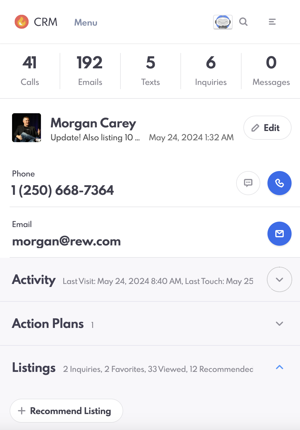
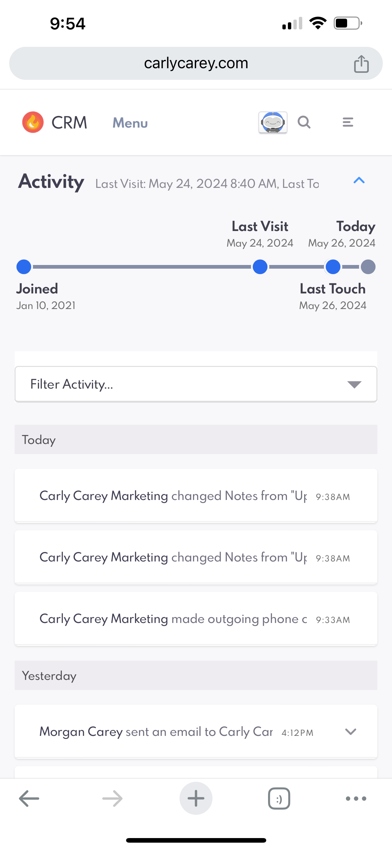
First of all, what is it? A complete redesign of the lead details page experience with a focus on mobile performance and a significant improvement over the previous generation’s separate “REW Leads” app which is now deprecated.
Here’s a quick screenshot from my computer: (looks awesome, right? So clean!)

But the computer is not the main focus of this CRM details page in terms of redesign: Where it REALY shines in terms of UI improvements is on the phone: (Screenshot also from my computer but resized to be like a phone < makes my life easier in making this post. )
And here is the old lead details on a phone for comparison:
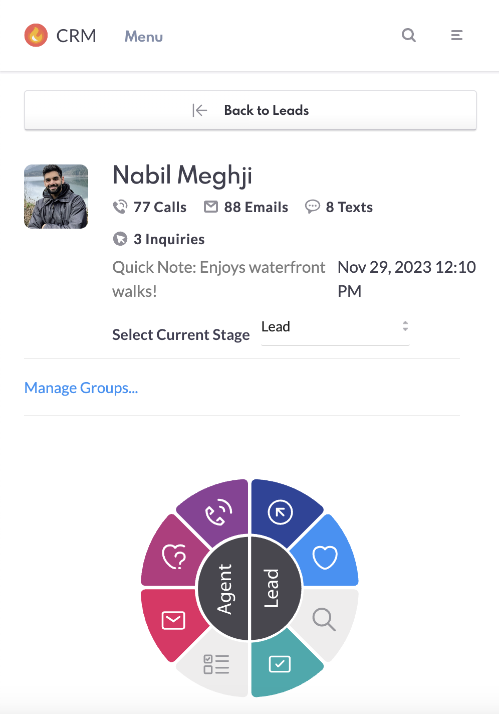
If I’m being honest, candidly the lead details screen on the previous CRM was the most in need of an upgrade, it worked, but users found the previous app layout much more user-friendly and so we wanted to come over the top with something awesome!
So what’s new? The UI is the biggest thing
In the new CRM the information that is most important is right at the top, it’s a new clean look, the fonts are big and easy to read and there are clear CTA’s to take action (Call, Text or Email)
Next: Each of the data segments has been redesigned and re-organized into convenient mobile friendly dropdowns that can be expanded or collapsed making for far easier access to the information you want, without having to scroll past the information you don’t.
All of the decks, so much better in terms of content and organization and WAY more usable on the phone!
But… it is a beta, and there are some things now that I’m using it with real data we definitely have to address before it is ready for prime time. (Anyone who’s ever wondered what UAT testing looks like at REW, here is a behind-the-scenes look ![]()
First issue to be resolved: Quick notes. These are critical (that’s why they live at the very top of the UI with phone and email) what I teach is your quick note should always be updated to be the last thing you did and the next action you plan to take.
You can click to add / edit a quick note (that’s great) - but you can’t really read it once it’s added (on the phone) < that is NO BUENO (observe)
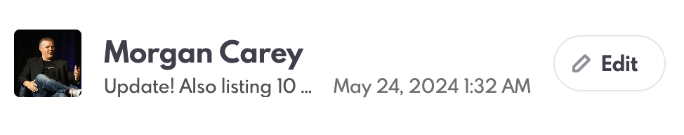
Can’t read it - I can “click it” and then scroll over but it’s a PITA, so that’s not going to work.
A couple of improvements/suggestions:
#1: In the UI (on phone only, this doesn’t apply to desktop) drop the year from the preview (don’t need it, your quick notes better not be more than a year old!) could also go to a day/m/y number format to save space.
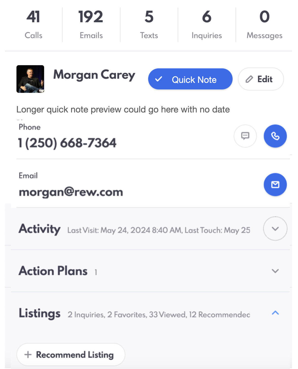
#2: I NEED to read the whole thing easily without scrolling left to right (that is not mobile friendly) - my thought is we could make it subtle (don’t love this but stick with me) and you could click on the pic (or initials if there is no pic) and it would open / hover the whole note. OR (this is the better suggestion) Bump the text down a line and then have “Quick Note” as a button alongside Edit.
Here’s a mockup as a starting point (this is not exactly what I want < longer names would crowd the button, don’t need the check box etc), but this is why we have @Phil - he’s a much better designer that I am ![]()
So clicking on the note to edit, that makes sense - but reading it (the whole thing, especially if it’s longer) we need a solve for that.
Next up activity view: LOVE this new look, but there is a known bug that happens on the timeline when several events are very close together and the origin event is really far back: (squishes everything to the right and overlaps) - I am sure you’re already working on this, just wanted to pop it in here.

Update on timeline: Actually I’m just checking on my iPhone, and perhaps this is a computer risize issue as it is working on my phone. Let’s just make sure we’re testing on all devices) Looks great on the actual phone. Is this resolved? (note, it really doesn’t have to work “on a PC resizing to try to be a phone” that is not a use case we’re building for.
Ok now this one has me stumped

First of all - Carly Carey Marketing (that is super admins name) is showing up twice. That’s just broken. But who the heck is Zhen yu? And why is the new automation engine showing up as a person in the activity filters?
I think we need to do a deep dive on the detailed activity filters and test against real data. Somethings seems “amiss” here. This one is likey up @FernandoOrtiz 's alley - btw I “know” who that is (they are a lead up to $900k budget that hasn’t been touched since Jan 2024 (@Carly *cough) but there is no reason I can think of that they would be associated with the Morgan Carey lead (not agent) profile,